PARAMOUNT ADVERTISING BRAND LANGUAGE
CHALLENGE: In 2016, a rapidly changing media landscape, it became apparent that CBS/Paramount’s sales-facing decks, emails and communications had subpar design attention paid to them, when compared to competitors. As we were in heated competition for market/revenue share, this took on increased importance especially as media buyers were compiling all potential partners in one master deck to review. We needed to not only stand out, but ensure that:
1. Our offerings were perceived as having undeniably premium value.
2. We viewed the recipients of the communications as ‘partners’ that we placed enormous value and care about our relationships with, as opposed to merely ‘clients’.
(Consultative Selling

This is what our sales materials looked like before
SOLUTION: I introduced the practice of giving our sales materials the same level of intention and refinement as the content creation side of the business.
Our materials began implementing the principles of information hierarchy, balance, timing, motion, weight etc. to achieve a ‘premium’ design language.
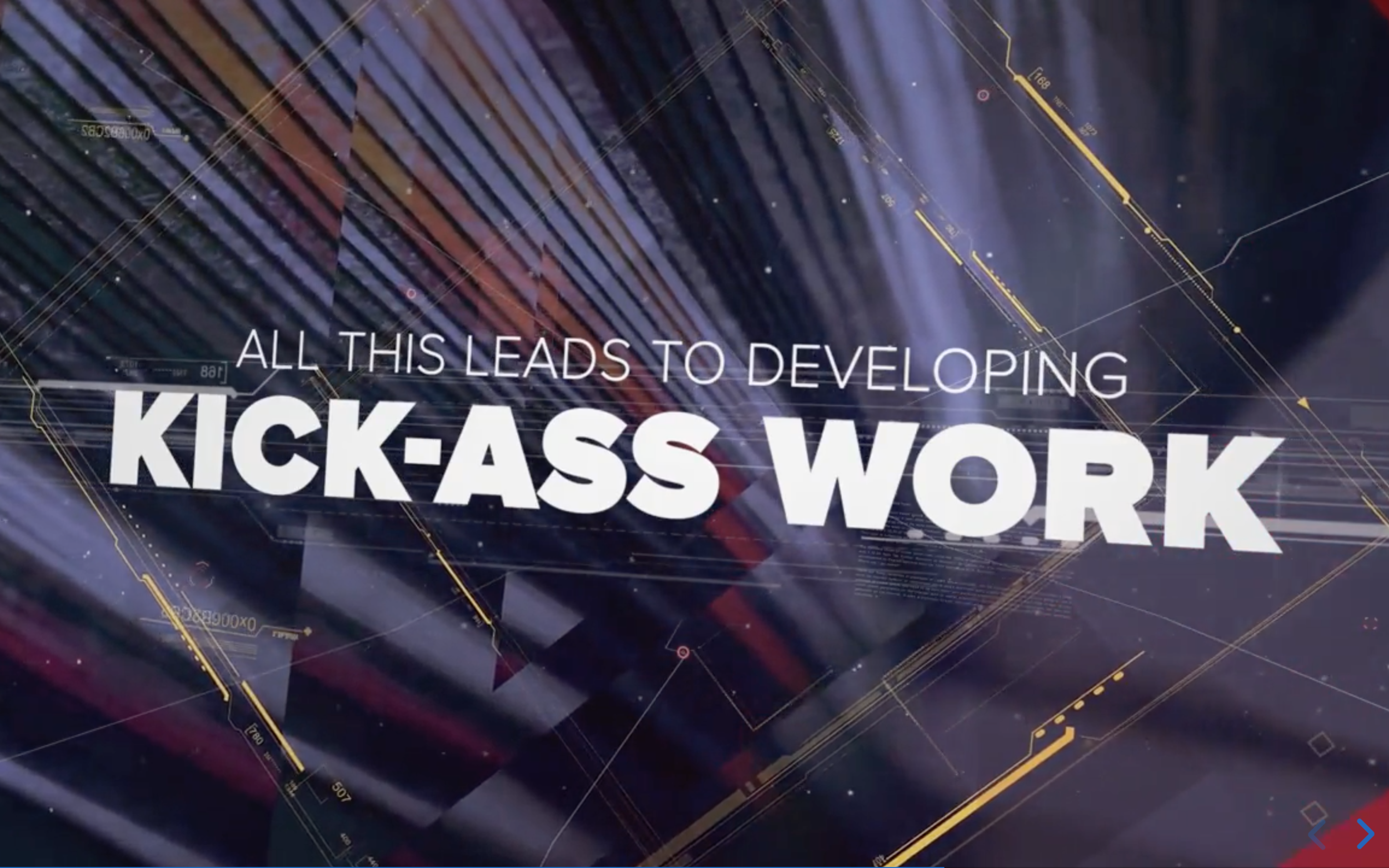
The first executive assignment with this approach was for CBSi's Studio 61's presentation at the 2017 IAB branded content summit. “It’s gotta blow the crowd away” was my direction.
I designed to be a seamless motion-designed experience, and the presentation was a huge success, with the IAB saying they'd never seen a presentation like this before.
While everyone was clicking through traditional abrupt start-stop Powerpoints, Cbsi brought down the house with this 3d fly-through seamless animation.


Viacom and CBS re-merged in 2019-2020, and very quickly re-branded as Paramount Global, behind the iconic movie studio, and launch of Paramount+ into the streaming wars. Everything was evolving quickly, as the merger meant new immersive ad opportunities for our partners, and it was quickly determined that the new company wide brand guidelines
( done by an outside agency ) didn’t meet the needs of our ad sales teams. I immediately created an alternative look and feel with multi-tiered applications and use cases, based around one guiding principle: Our ideas, programs, and IP were of undeniably premium value. All of our internal and external communications should convey that immediately. Even Nickelodeon with it’s slime and wild look can be framed as a premium product. Our head of sales John Halley loved it so much, fought to, and continues to use this style today as it evolves, instead of that company wide re-brand toolkit.
The White Mountain
This treatment was for head of sales to use himself for his top-level communications and in-person meetings, both internally and externally. I made the choice to go for a white snowy mountain with looping animated clouds to make our iconic mountain feel a little more modern and tech-focused, and to mirror the ad campaign they had with all the stars on ‘Paramount Mountain’. The font began as Helvetica Neue, but evolved into Avenir for ease of distribution, and the backgrounds were preferably light, off-white.
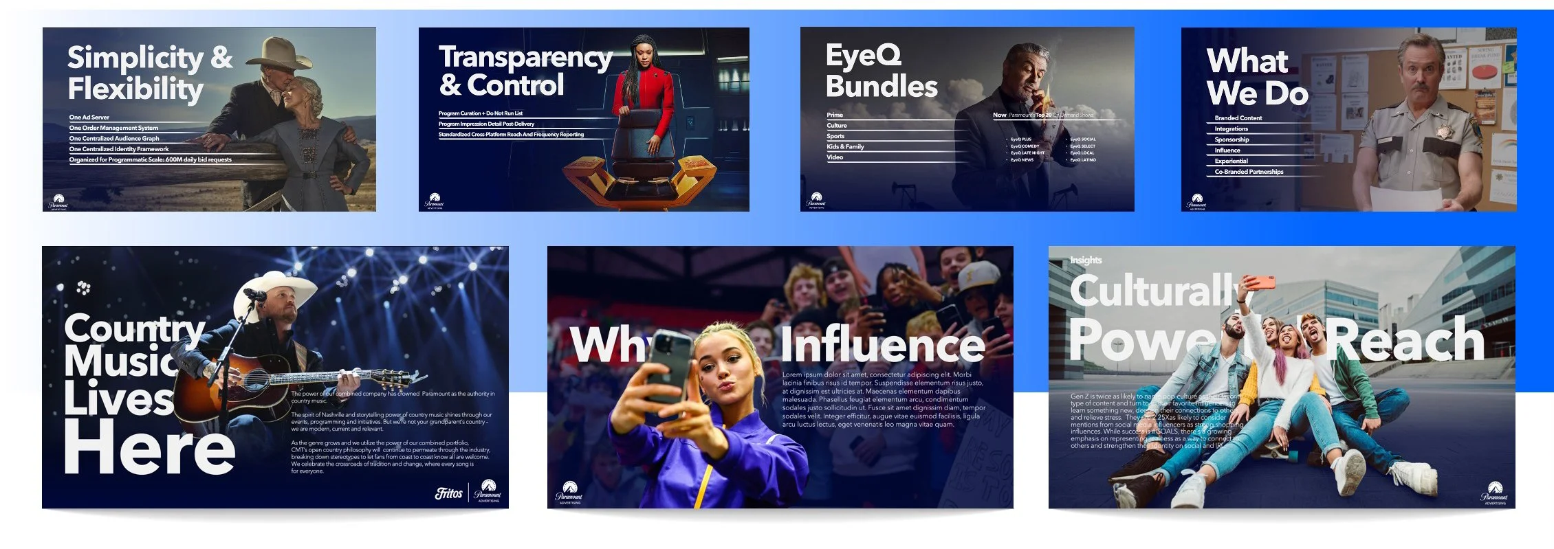
THE GENERAL PRESENTATION
Every year in coordination with the annual up-front events, we release and present our general marketing positioning statement, publicly and to our ad partners. While still maintaining a premium high-end feeling, It is important to lean into our vast library of IP to garner excitement and connection. We made our stars the heroes, going with full-screen image treatment with gradient fades, keeping copy as light as possible, and custom text interaction via cutout usage. This GP, and those of all the cascading shows/properties has fallen to myself and my team for more than a decade..
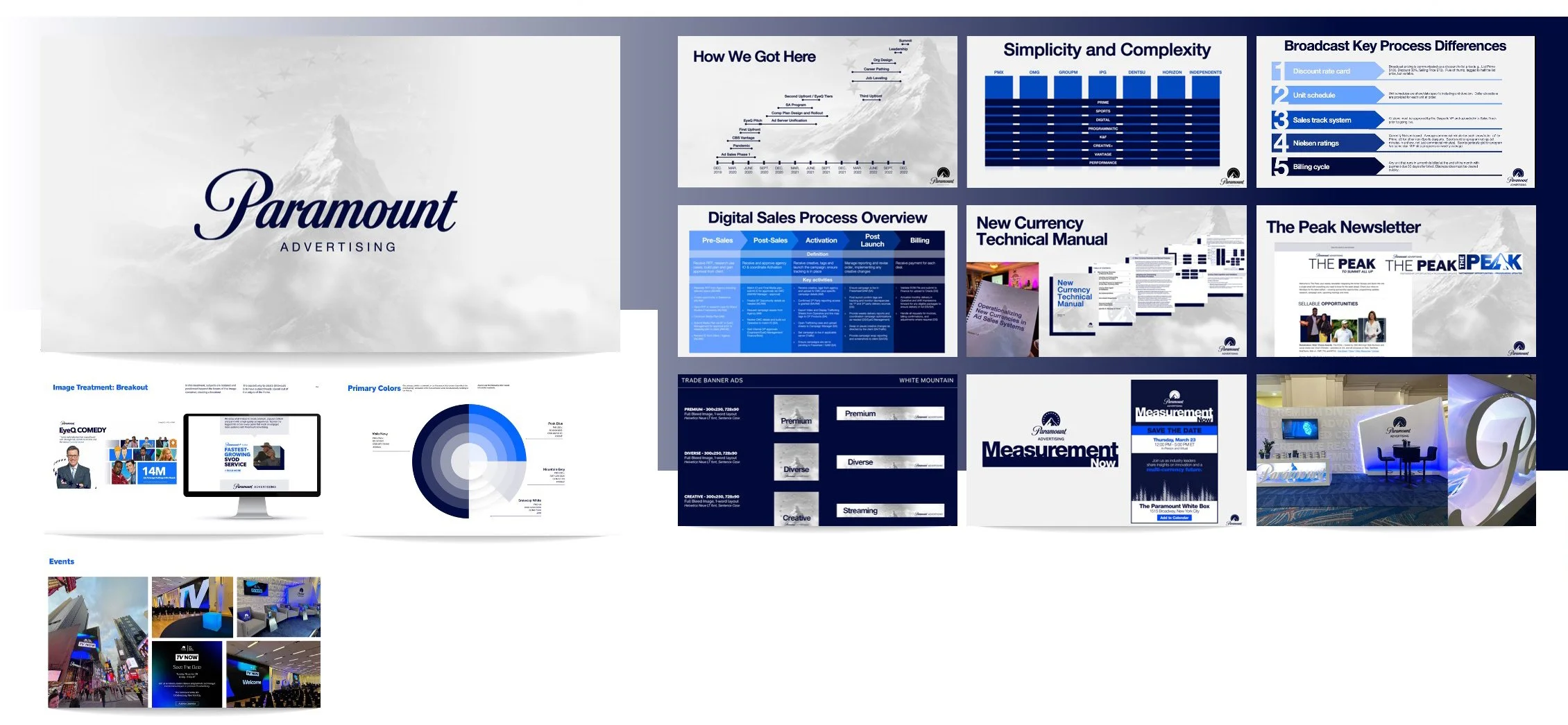
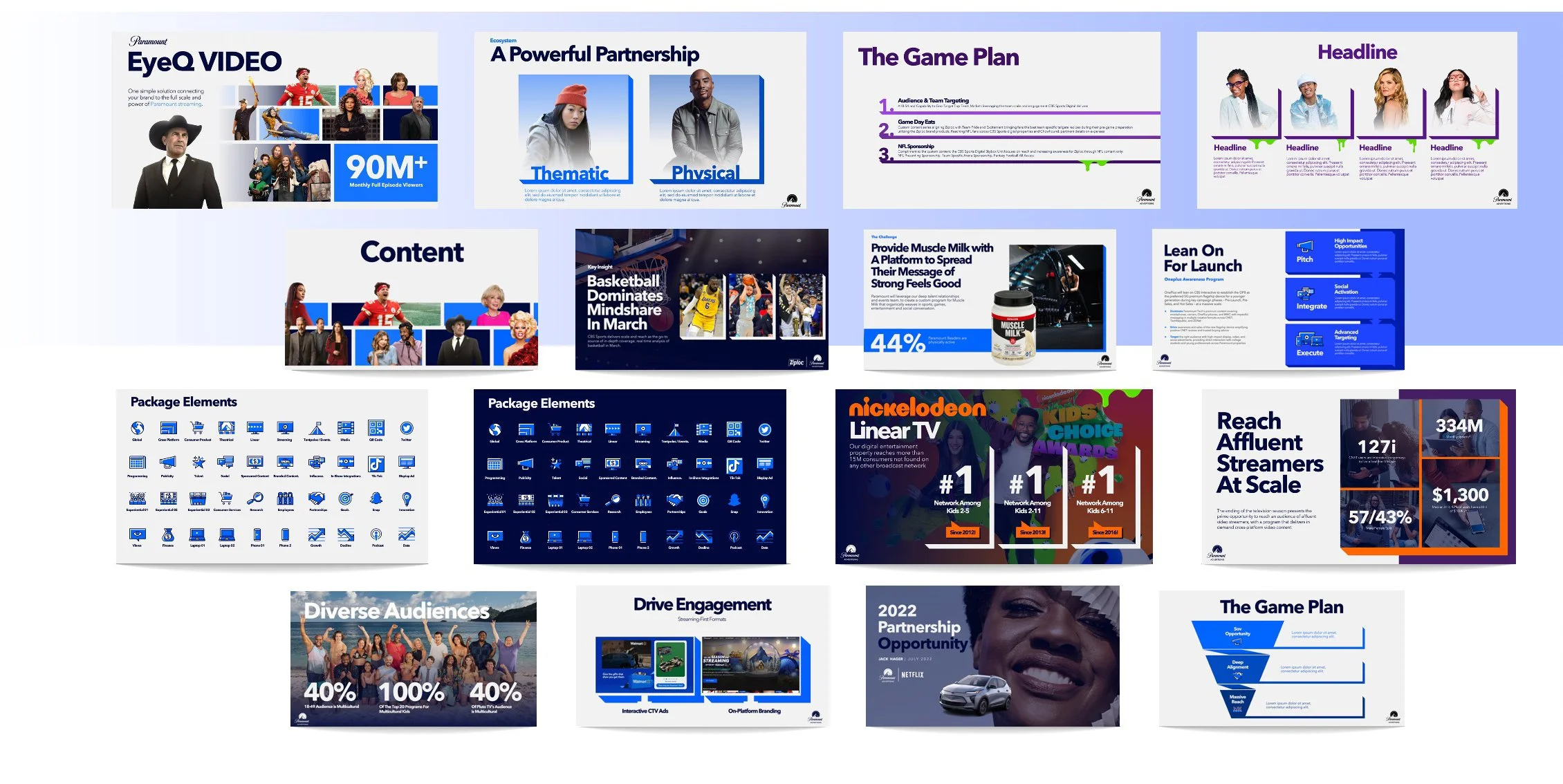
THE PITCH / MARKETING TEMPLATE
The Sales and Marketing teams at Paramount are in constant negotiation and ideation, moving rapidly and creatively in an eve-evolving media landscape.
They need to be able to react quickly and nimbly without losing design quality and still presenting a premium product. Myself and my team have been the creators of the vast 300+ slide templates for the pitch and marketing teams, doing in-person and zoom trainings and support for usage.

ADDITIONAL DESIGN: ALAN BAYANETO, ANDRE, MASON, JESSICA CABATO, JOLAN WOOD